Showing posts with label AndroidTricks. Show all posts

Android Json Parsing basics tutorial

Step by Step guide to learn Json and parsing it in android.  

JSON is very light weight, structured, easy to parse and much human readable. JSON is best alternative to XML when your android app needs to interchange data with your server. 

In this tutorial we are going to learn how to parse JSON in android.But Before that we need to get the basics of Json correctly understood so that it could become easy to implement.


JSON stands for JavaScript Object Notation.It is an independent data exchange format and is the best alternative for XML.

Json_Basic_tutorial androidgreeve

You can see the difference between an XML and Json in the below code.


Simple Example :

Json Version of It.

{"employees":[
    {"firstName":"John", "lastName":"Doe"}, 
    {"firstName":"Anna", "lastName":"Smith"},
    {"firstName":"Peter", "lastName":"Jones"}
]}

This XML syntax also defines an employees object with 3 employee records:

The XML version of it.

<employees>

    <employee>
        <firstName>John</firstName> <lastName>Doe</lastName>
    </employee>
    <employee>
        <firstName>Anna</firstName> <lastName>Smith</lastName>
    </employee>
    <employee>
        <firstName>Peter</firstName> <lastName>Jones</lastName>
    </employee>
</employees>

Android provides four different classes to manipulate JSON data. 


These classes are JSONArray,JSONObject,JSONStringer and JSONTokenizer.


The following table will help to understand in detail about it.


JSON Syntax Rules

JSON syntax is a subset of the JavaScript object notation syntax:
  • Data is in name/value pairs
  • Data is separated by commas
  • Curly braces hold objects
  • Square brackets hold arrays
JSON data is written as name/value pairs.

A name/value pair consists of a field name (in double quotes), followed by a colon, followed by a value:

"firstName":"John"


JSON Values

JSON values can be:
  • A number (integer or floating point)
  • A string (in double quotes)
  • A Boolean (true or false)
  • An array (in square brackets)
  • An object (in curly braces)
  • null

Lets see some Sample JsonArray String 


JSONArray String is like this


[{

"internalName": "blaaa",
"dataVersion": 0,
"name": "Domin91",
"profileIconId": 578,
"revisionId": 0,
},
{
"internalName": "blooo",
"dataVersion": 0,
"name": "Domin91",
"profileIconId": 578,
"revisionId": 0,
}]


An example of JSONObject Is like this

{
"internalName": "domin91",
"dataVersion": 0,
"name": "Domin91",
"profileIconId": 578,
"revisionId": 0,


You can find the difference in the braces of the JSonArray and JsonObject.


Why Json?Why not XML? Difference?Advantages  all this question answer can be found below.


Advantages of JSON
  • Smaller message size
  • More structural information in the document
    • Can easily distinguish between the number 1 and the string "1" as numbers, strings (and Booleans) are represented differently in JSON.
    • Can easily distinguish between single items and collections of size one (using JSON arrays).
  • Easier to represent a null value
  • Easily consumed by JavaScript
Advantages of XML
  • Namespaces allow for sharing of standard structures
  • Better representation for inheritance
  • Standard ways of expressing the structure of the document: XML schema, DTD, etc
  • Parsing standards: DOM, SAX, StAX
  • Standards for querying: XQuery and XPath
  • Standards for transforming a document: XSLT
Draw
  • Human Readable
  • Easy to parse
You can find lots of tools to convert from XMl to Json and viceversa.

Here we end the basics of Json.In the next tutorial we will how to actually parse json in Android app , and it advantages.


If any doubts feel free to ask in the comment below.Any suggestion to be added you are welcomed.


How to apply Material Design to your app

Changes HDDMigration to be made from Holo to Material.

The Android 5.0 SDK was released(if you want know step by step guide to installing it) last Friday, featuring new UI widgets and material design, our visual language focused on good design. To enable you to bring your latest designs to older Android platforms we have expanded our support libraries, including a major update to AppCompat, as well as new RecyclerViewCardView and Palette libraries.
In this post we'll take a look at what’s new in AppCompat and how you can use it to support material design in your apps.

We will go Step by Step to make changes for Material Design:

From ActionbarCompact to AppCompactv21

AppCompat (aka ActionBarCompat) started out as a backport of the Android 4.0 ActionBar API for devices running on Gingerbread, providing a common API layer on top of the backported implementation and the framework implementation. AppCompat v21 delivers an API and feature-set that is up-to-date with Android 5.0.

Three things to lookout or there might be three situations we need to consider.

Setting up the things first to migrate to appcompact v21:

Migrating from holo to material.

If you have followed the guidelines correctly then you don't require to change lots of thing in your app for migration.

A)Open the values Folder that contains the Themes.xml file and change accordingly.
values/themes.xml:
<style name="Theme.MyTheme" parent="Theme.AppCompat.Light">
   
<!-- Set AppCompats actionBarStyle -->
   
<item name="actionBarStyle">@style/MyActionBarStyle</item>

    <!-- Set AppCompat’s color theming attrs -->
    <item name=”colorPrimary”>@color/
my_awesome_red</item>
    <item name=”colorPrimaryDark”>@color/
my_awesome_darker_red</item>
   
    <!-- The rest of your attributes -->
</
style>

Note:
B)If you are using gradle , add appcompat as a dependency in your build.gradle file:
just paste the below code in dependency
dependencies {
    compile
"com.android.support:appcompat-v7:21.0.+"
}
 C) Now you can remove all other actionbar styles.

2)Apply themes using new color palette attributes:
Checkout the new colors added in Android 5.0 Lollipop


D)Copy the code the themes,xml in values folder.
<!-- colorAccent is used as the default value for colorControlActivated,
         which is used to tint widgets -->
    <item name=”colorAccent”>@color/
accent</item>

    <!-- You can also set colorControlNormal, colorControlActivated
         colorControlHighlight, and colorSwitchThumbNormal. -->


In the next post we will look at how to create a Actionbar from scratch using the latest Material Design.

We would ask you to try this things and comments if you face with some problems,
Please like and share with other dev who are willings to try this out too!

Happy developing!Happy Coding!


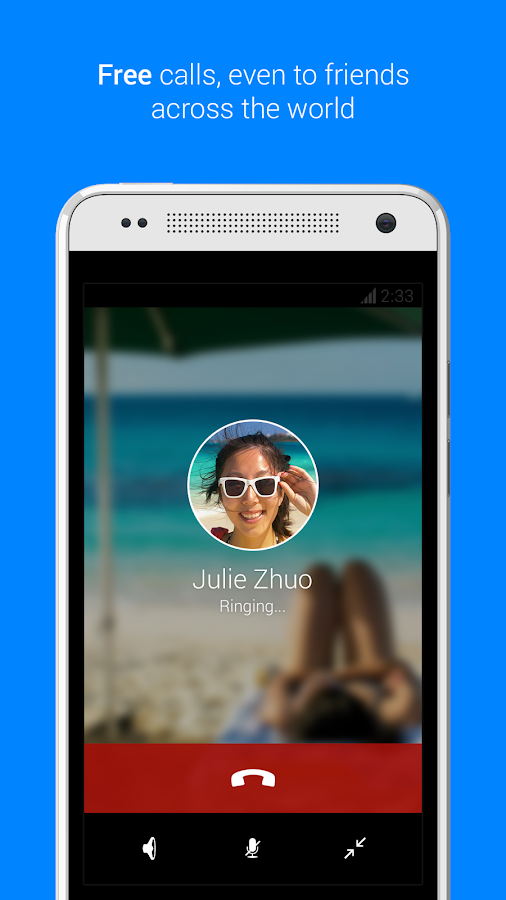
Facebook Messenger like profile image crop in android

Lots of our reader send me email asking for how to crop image as in google plus app and facebook messanger profile image in circle.So I decided to put this tutorial live on how you can crop that imageview in circle.

There are more ways of doing it I got this using the canvas elements on the android.The android bitmap can be used to align,stretch,and lots more.The Android bitmapdrawable give a lots of flexibilty to attain image crop.

Some inspiration of what we are trying to build is somthing like this:
 
Above is the Image of facebook messanger .The profile image here is cropped to circle.This is what we are going to develop.

Lets start creating.

1.Create New ProjectNew->Android Application Project.
2.Create New Class file RoundprofImage.java 
Right Click on package com.androidgreeve.profile.roundimage ->New->RoundprofImage.java
3.Copy the below code in roundimage.java file
package com.androidgreeve.profile.roundimage
importandroid.graphics.Bitmap;
importandroid.graphics.BitmapShader;
importandroid.graphics.Canvas;
importandroid.graphics.ColorFilter;
importandroid.graphics.Paint;
importandroid.graphics.PixelFormat;
importandroid.graphics.Rect;
importandroid.graphics.RectF;
importandroid.graphics.Shader;
importandroid.graphics.drawable.Drawable;
public class RoundImage extends Drawable {
      private final Bitmap mBitmap;
      private final Paint mPaint;
      private final RectF mRectF;
      private final int mBitmapWidth;
      private final int mBitmapHeight;
      publicRoundImage(Bitmap bitmap) {
            mBitmap = bitmap;
            mRectF = new RectF();
            mPaint = new Paint();
            mPaint.setAntiAlias(true);
            mPaint.setDither(true);
            final BitmapShader shader = new BitmapShader(bitmap, Shader.TileMode.CLAMP, Shader.TileMode.CLAMP);
            mPaint.setShader(shader);
            mBitmapWidth = mBitmap.getWidth();
            mBitmapHeight = mBitmap.getHeight();
      }
      @Override
      public void draw(Canvas canvas) {
            canvas.drawOval(mRectF, mPaint);
      }
      @Override
      protected voidonBoundsChange(Rect bounds) {
            super.onBoundsChange(bounds);
            mRectF.set(bounds);
      }
      @Override
      public void setAlpha(int alpha) {
            if (mPaint.getAlpha() != alpha) {
                  mPaint.setAlpha(alpha);
                  invalidateSelf();
            }
      }
      @Override
      public voidsetColorFilter(ColorFilter cf) {
            mPaint.setColorFilter(cf);
      }
      @Override
      public int getOpacity() {
            return PixelFormat.TRANSLUCENT;
      }
      @Override
      public intgetIntrinsicWidth() {
            return mBitmapWidth;
      }
      @Override
      public intgetIntrinsicHeight() {
            return mBitmapHeight;
      }
      public void setAntiAlias(boolean aa) {
            mPaint.setAntiAlias(aa);
            invalidateSelf();
      }
      @Override
      public voidsetFilterBitmap(boolean filter) {
            mPaint.setFilterBitmap(filter);
            invalidateSelf();
      }
      @Override
      public void setDither(boolean dither) {
            mPaint.setDither(dither);
            invalidateSelf();
      }
      public Bitmap getBitmap() {
            return mBitmap;
      }

}

Now you can add the image view in activity_main.xml file.copy the following code in it.
Activity_main .xml

<?xml version="1.0"encoding="utf-8"?>
<LinearLayout xmlns:android="http://schemas.android.com/apk/res/android"
    android:layout_width="match_parent"
    android:layout_height="match_parent"
    android:background="#000000"
    android:orientation="vertical" >
    <ImageView
        android:id="@+id/imageView1"
        android:layout_width="100dp"
        android:layout_height="100dp"
        android:scaleType="centerCrop"
        android:layout_gravity="center"
        android:src="@drawable/image" />
<TextView
        android:layout_width="wrap_content"
        android:layout_height="wrap_content"
        android:layout_centerHorizontal="true"
        android:layout_centerVertical="true"
        android:text="@string/Androidgreeve"/>
 

</LinearLayout>
import android.app.Activity;
importandroid.graphics.Bitmap;
importandroid.graphics.BitmapFactory;
importandroid.os.Bundle;
importandroid.widget.ImageView;
importcom.androidgree.profile.roundprofimage.R;
public class MainActivity extends Activity {
      ImageView imageView1;
      RoundImage roundedImage;
      @Override
      protected void onCreate(Bundle savedInstanceState) {
            super.onCreate(savedInstanceState);
            setContentView(R.layout.activity_main);
            imageView1 = (ImageView) findViewById(R.id.imageView1);
            Bitmap bm = BitmapFactory.decodeResource(getResources(),R.drawable.image);
            roundedImage = new RoundImage(bm);
            imageView1.setImageDrawable(roundedImage);
      }
}
Run the project .All is done now!
Hope you find easier to understand the code.Please Comment your views
Sponsor:
Do miss out to check out the offer of the month post! we already started gifting the Ebooks.

Login screen with Compound drawables

In the last post we looked about the Compound drawables that makes the easy designing of your app.
The compound drawables  can be used to place the image next to textbox.
So In this post we will go through an example of using it by creating a sample login screen.


In the last post we looked about the Compound drawables that makes the easy designing of your app.
The compound drawables  can be used to place the image next to textbox.
So In this post we will go through an example of using it by creating a sample login screen.


So let’s start by creating a new project.

1. Create a new project in Eclipse from File --> New --> Android --> Application Project. While creating the project select the app theme which has Action Bar as shown in the below image.

2.Open the activity_main.xml for creating the layout of the app.
Type the code in the activity_main.xml

<LinearLayout xmlns:android="http://schemas.android.com/apk/res/android"
android:layout_width="250dp"
android:layout_height="wrap_content"
android:layout_gravity="center_horizontal"
android:gravity="center"
android:orientation="vertical"
android:layout_marginTop="16dp"
>

<EditText
android:layout_width="match_parent"
android:layout_height="wrap_content"
android:gravity="center_vertical"
android:hint="@string/user_name"
android:drawableLeft="@drawable/ic_action_person"
android:drawablePadding="8dp"
/>
<EditText
android:layout_width="match_parent"
android:layout_height="wrap_content"
android:gravity="center_vertical"
android:hint="@string/password"
android:drawableLeft="@drawable/ic_action_accounts"
android:drawablePadding="8dp"
/>
<Button
android:layout_width="match_parent"
android:layout_height="wrap_content"
android:text="@string/log_in"
android:drawableRight="@drawable/ic_action_accept"
/>

</LinearLayout> 
 
3.Run the app  


Please subscribe to our site.Share it on facebook and twitter.